Google’s New 3D Emojis: Cool Toys or Just More Bloat?
Google just dropped 4,000 new 3D emojis. As a dev, I’m looking at the asset weight, but as a user, I’m wondering if this finally stops the 'Android emojis look cheap' insults.
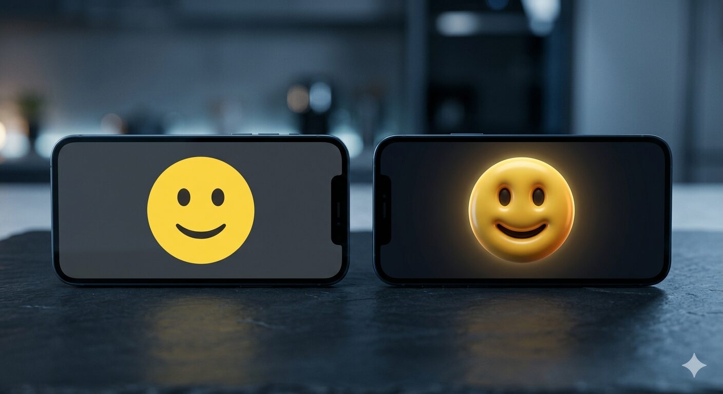
My phone buzzed with the Android 17 update news while I was huddled in a hoodie, trying to beat a deadline during a surprisingly chilly morning here in Jos. Usually, I’d ignore the UI fluff to focus on the Gemini Intelligence API docs, but 4,000 redesigned emojis is hard to miss. Google is officially killing off the flat, minimalist look of the Noto font and replacing it with something they're calling "Noto 3D."
They want our emojis to feel like physical objects. A laughing face that looks like it could bounce; a heart that actually has volume. It’s a massive shift from the clean, vector-style icons we’ve used for years.
The "No Gree For Anybody" Aesthetic
In Nigeria, we use emojis like punctuation. You can’t tell a client "The server is down" without adding a weary face or a "pleading" emoji to soften the blow. It’s part of the digital hustle. If you’re communicating with someone in a noisy bus park in Owerri or a quiet workstation in Gbagada, the visual tone matters.
The move to 3D feels like Google is finally trying to kill the "Android emojis look low-budget" narrative that iPhone users love to weaponize. If these new icons look as premium as the early renders suggest, it might actually bridge that weird social gap during cross-platform chats.

The Developer’s Dilemma: Weight vs. Beauty
As a dev, my first thought isn't "Oh, how pretty." It’s "How big is this font file?"
The current Noto Color Emoji font is already a chunky bit of business to bundle into an app. Moving to 3D implies textures, lighting data, and more complex gradients. If I’m building a lightweight fintech app for someone using a five-year-old device with limited storage in a place like Akure, I’m sweating a little about the overhead.
Google says they’re bringing "physicality" to the digital conversation. That’s great for the Pixel users who get it first, but the real test is how this renders on the millions of mid-range Samsung and Tecno devices that dominate the local market. If the 3D depth makes the keyboard lag or if the assets don't scale properly on low-DPI screens, then we’ve just traded performance for a shiny toy.
Why 3D, Why Now?
It feels like we’ve come full circle. We went from the "blobs" (which I actually miss, don't judge me) to flat design, and now we’re going back to depth. It’s almost skeuomorphic again.
Maybe it’s because flat design has become boring. Or maybe, with the rise of spatial computing and AR, Google wants their design language to be ready for screens that aren't just flat glass bricks. When you're "No gree-ing" for anybody in a digital space, having an emoji that looks like it has weight adds a bit of gravitas to the vibe.
I’m curious to see how the local "Sapa" struggle will be represented in 3D. Will the "empty wallet" emoji look even more depressing with realistic shadows? Probably.
The Pixel rollout happens later this year. Until then, I'll be here in Jos, watching my flat emojis and wondering if 3D shadows are really what's going to make my Git commits feel more "physical." Probably not, but at least the group chat will look a lot more expensive.
Related from Nigeria
Let's build your next big product.
Accepting project-based freelance, remote engineering roles, and hybrid positions.