Your Users Aren't Reading Your Copy—And It's Getting Worse
Reading comprehension is collapsing globally, and as developers, we can no longer pretend a wall of text will solve user onboarding. Here is how I'm rethinking UI for a world that skims.
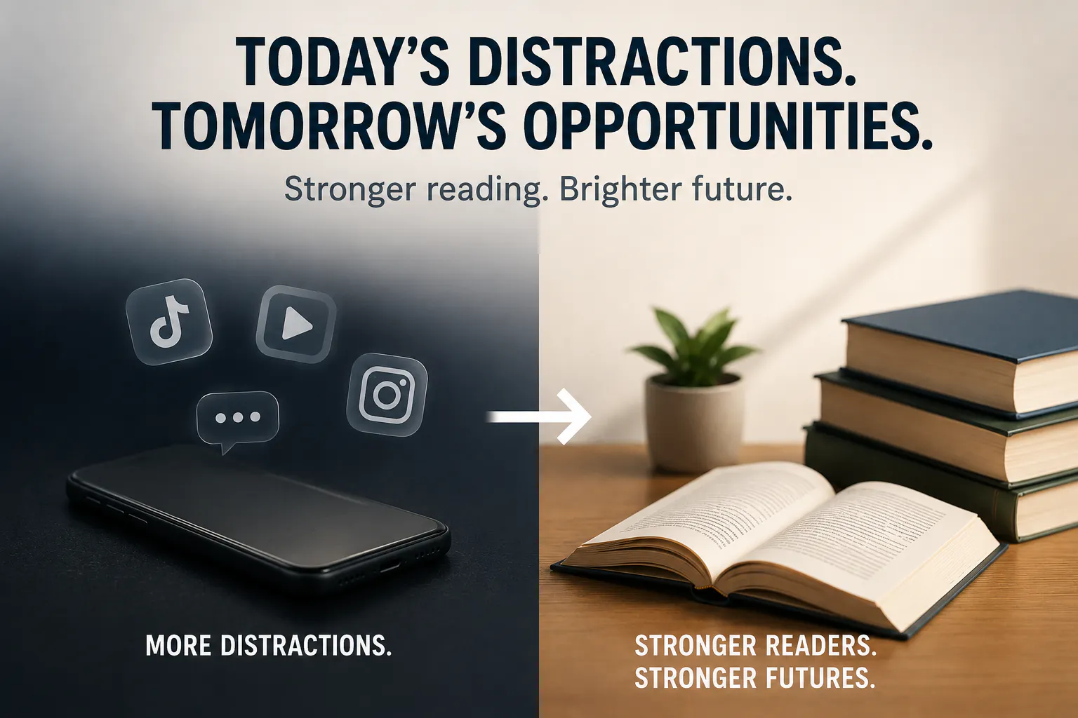
My younger cousin spent fifteen minutes struggling with a simple payment flow last week, completely stuck on a page that had explicit, step-by-step text right in the middle of the screen. He didn't read a single line. He just kept tapping random buttons, waiting for visual feedback.
When I asked him why he didn't just read the bold sentence at the top, he looked at me like I'd asked him to translate ancient Greek.
Latest data from the US National Assessment of Educational Progress shows that reading proficiency among students has fallen off a cliff—only around 30% of eighth graders are hitting proficient reading levels, while over a third fall below basic. People like to attribute this purely to lockdown disruptions or broken school systems, but if you build products for a living, you know the real culprit. We've spent the last decade optimizing algorithms on platforms like TikTok, Reels, and YouTube Shorts to trade deep focus for micro-doses of quick stimulation.
And if you think this is just an American classroom issue, step outside and look at how people interact with technology right here.

Long Copy Is a Product Bug
In Nigeria, we already deal with low-bandwidth environments, spotty connections, and expensive mobile data. Users are trying to get in, do what they came for, and get out before their subscription expires or "Sapa" catches up with their wallet.
Now, layer on the fact that attention spans have been completely shredded.
If a teenager in Owerri or a trader in Onitsha opens your app and sees a wall of explanatory text, they won't read it. They will abandon the session. I see local founders and devs still building fintech and edtech onboarding flows that look like legal contracts. They dump three slides of dense text explaining "features" before letting a user touch the dashboard.
That design approach is dead.
If your software requires a paragraph of text to explain how a button works, your UI is broken. Users don't read instructions anymore—they feel their way through an application through instant visual feedback, tactile micro-animations, and audio cues. That's why WhatsApp voice notes completely replaced long text messages across every demographic in this country. People don't want to parse sentences if they can swipe or listen.

Rethinking the Tech Stack for Short Attention Spans
So what does this actually mean for us sitting behind keyboards, writing React components or designing database schemas?
It means we have to stop relying on documentation and copy to fix bad user flows. Here is how my own approach to building product features has shifted:
- Progressive Disclosure over Everything: Don't throw all the information at the user at once. Hide advanced configuration behind explicit toggles. Show only what is necessary for the immediate state transition.
- Audio and Visual Feedback Loops: If a transaction fails or an input is invalid, skip the verbose error message. Use distinct haptic feedback, clear color transitions, or short voice prompts.
- Bite-Sized EdTech State Machines: For those building learning tools—especially aimed at kids or young developers in places like Akure or Enugu—ditch the PDF download model. Break down technical concepts into micro-interactive nodes. Give them small dopamine hits for completing a 30-second task instead of asking them to read a chapter.
The Double-Edged Sword
Part of me feels nostalgic for the days when you could drop a well-written blog post or a detailed manual and expect users to engage with it. Deep reading builds deep critical thinking, and watching that skill erode across an entire generation of internet users is depressing.
But as a developer, my job isn't to complain about how human behavior should be. My job is to build tools that work for human behavior as it actually exists today.
If users are reading less, we have to write clearer code, design sharper interfaces, and make our products self-explanatory from the very first frame. If your app can't communicate its core value in three seconds without forcing someone to read a paragraph, back to VS Code you go.
Related from Tech
Let's build your next big product.
Accepting project-based freelance, remote engineering roles, and hybrid positions.